My role
Logo Design
Typography
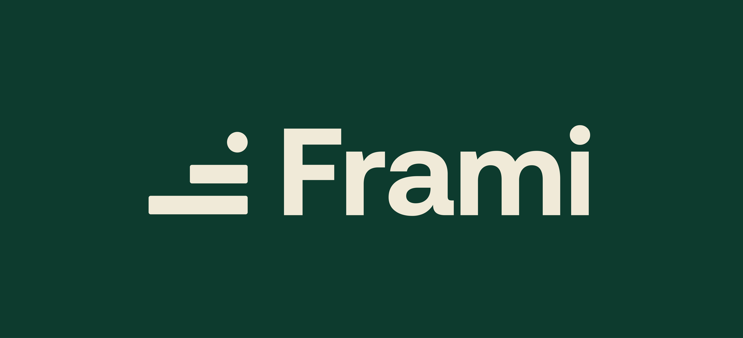
Redesigned the logo
with a modern look.
Selected a cleaner,
modern typeface.
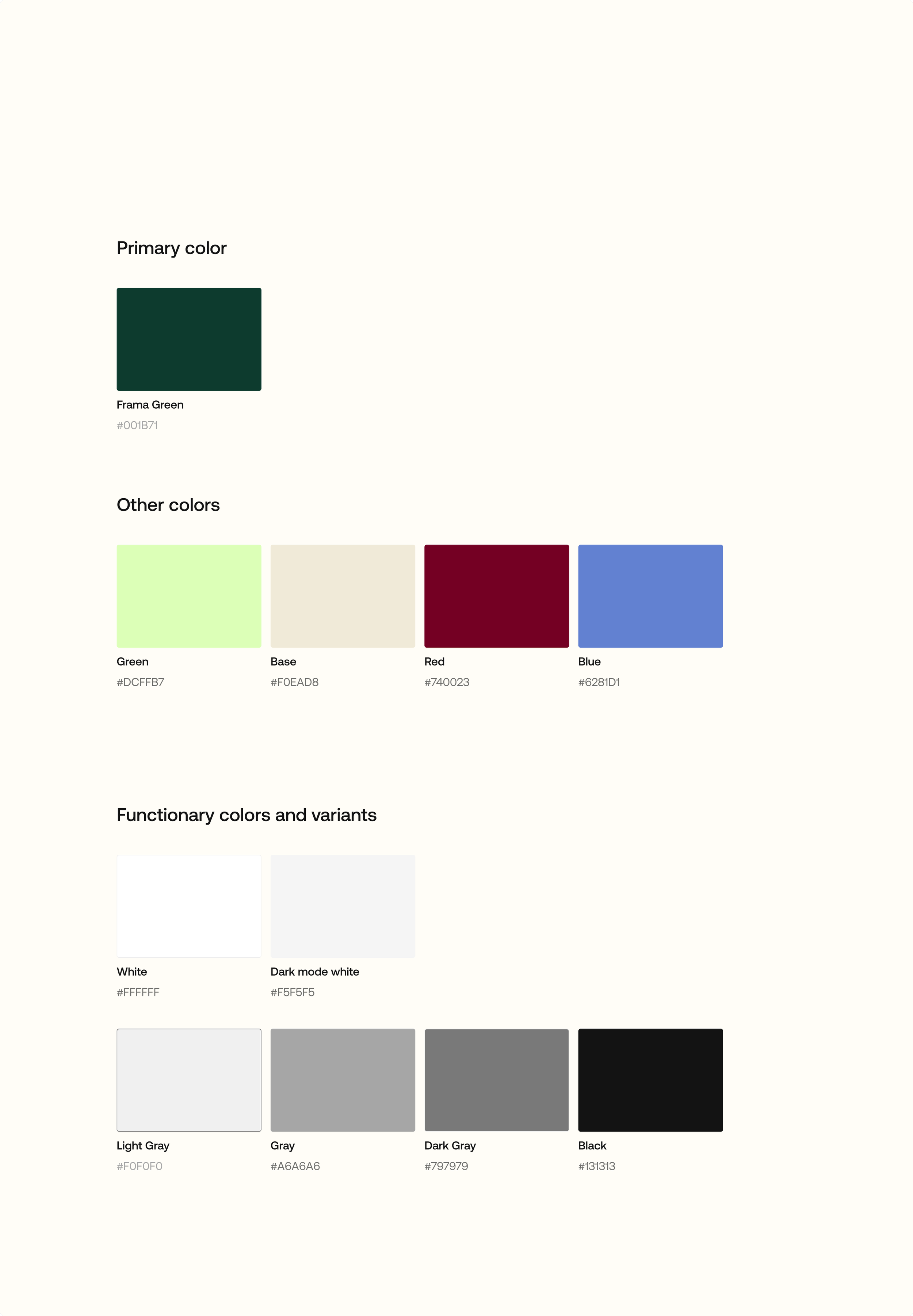
Color Palette
Brand Identity
Refined the brand
colors.
Created a flexible
visual system.
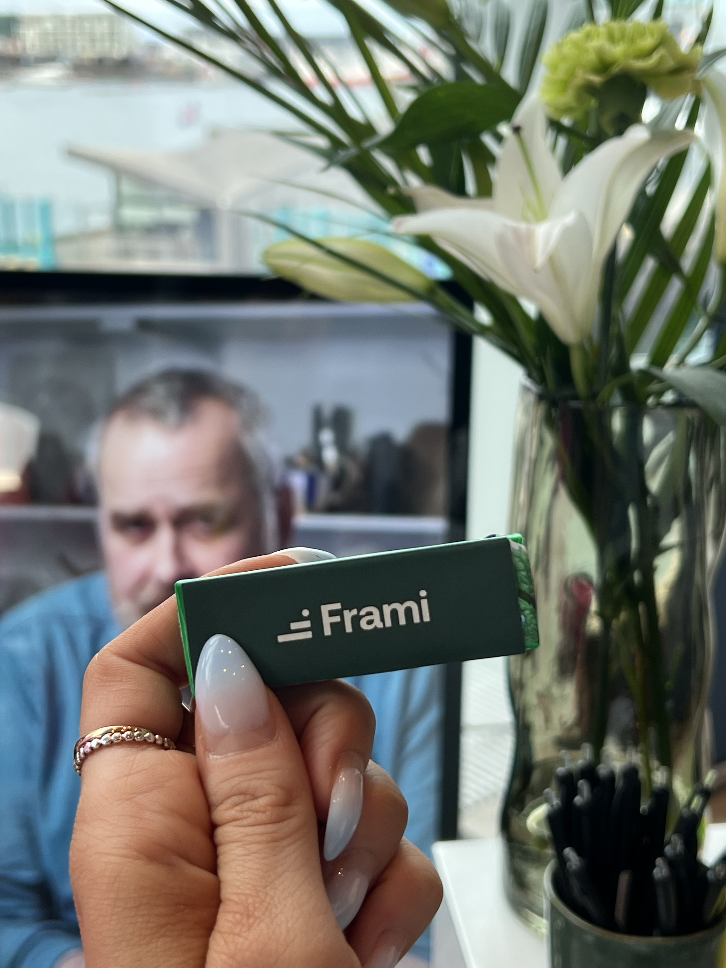
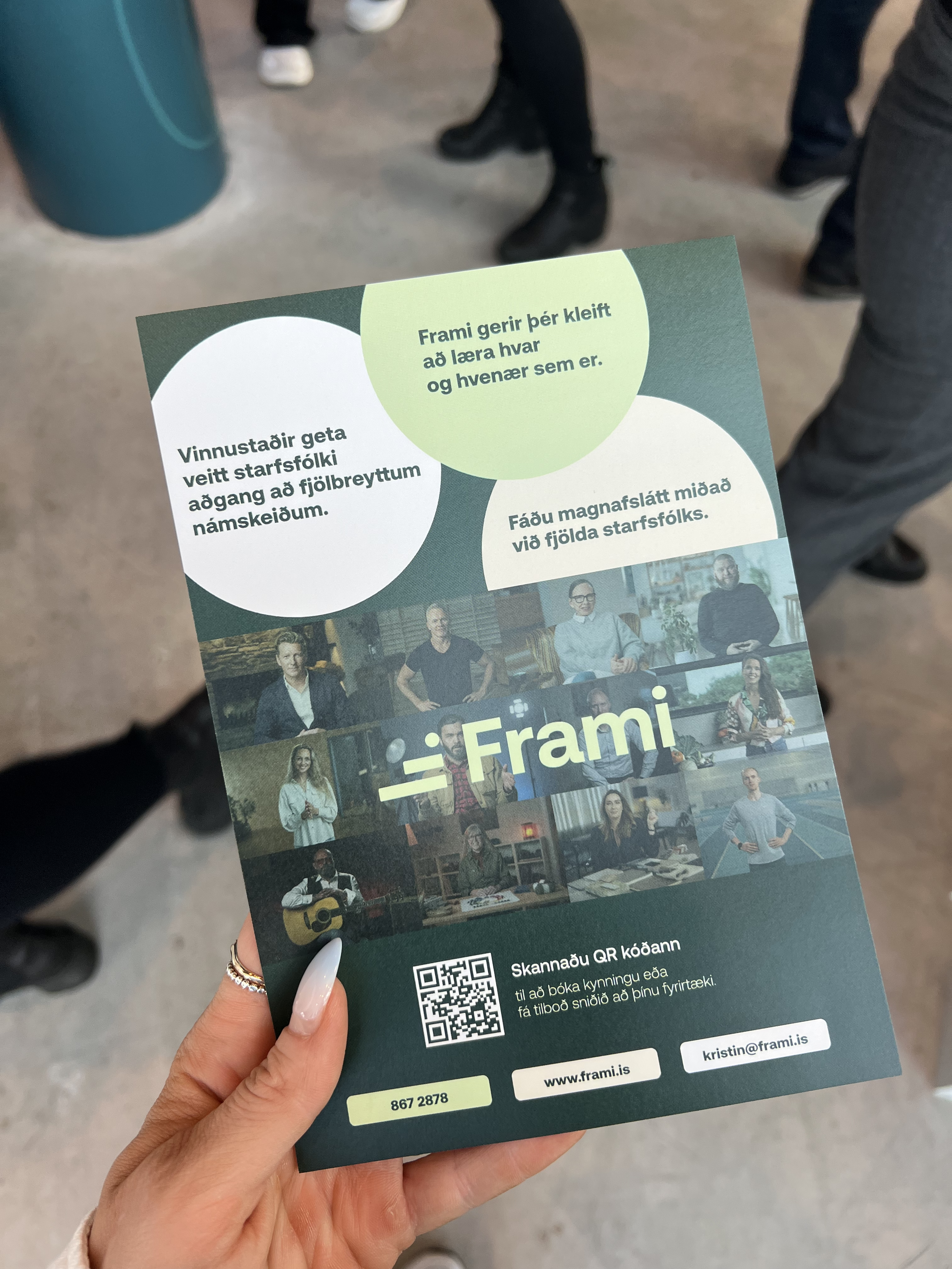
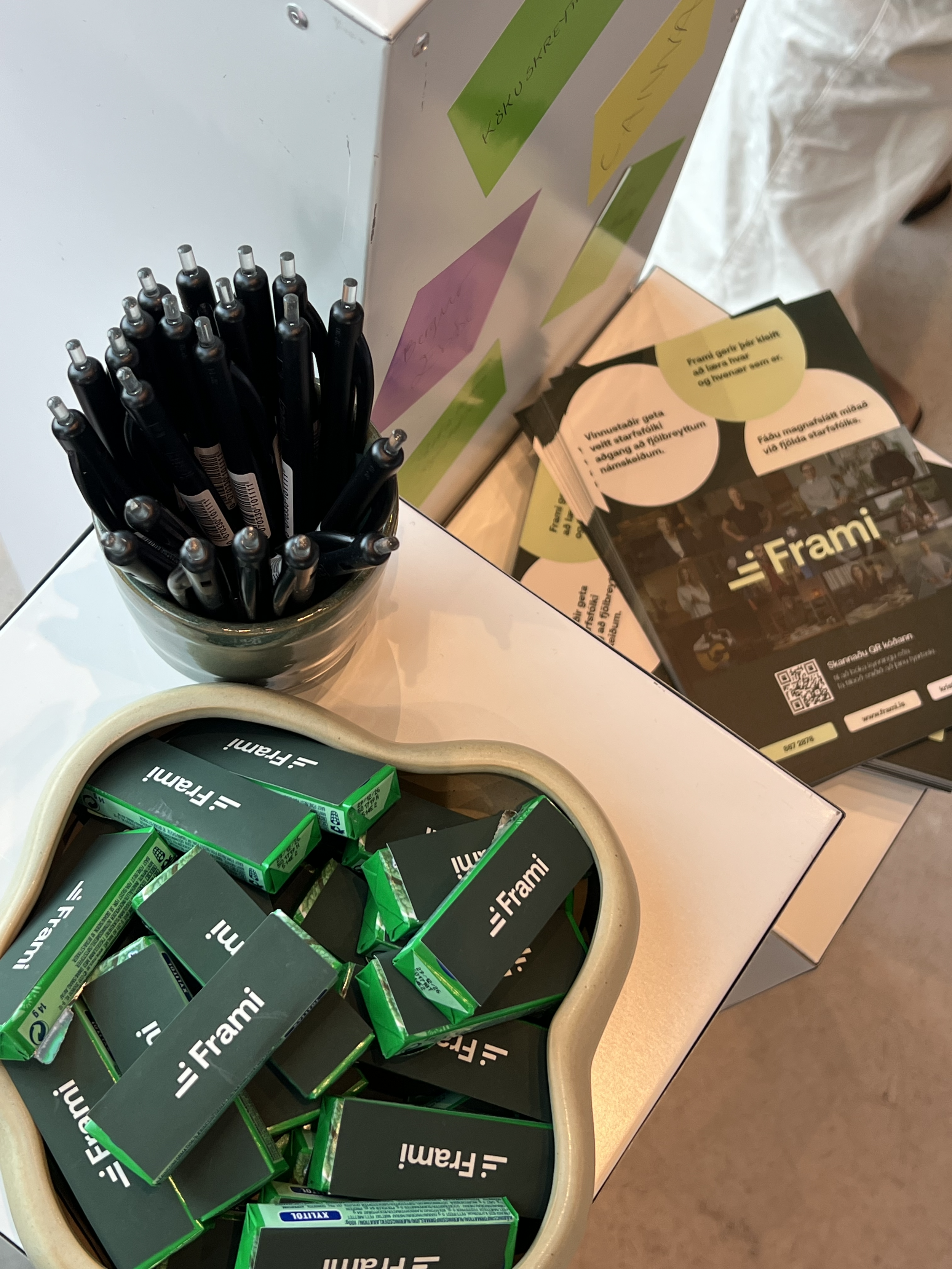
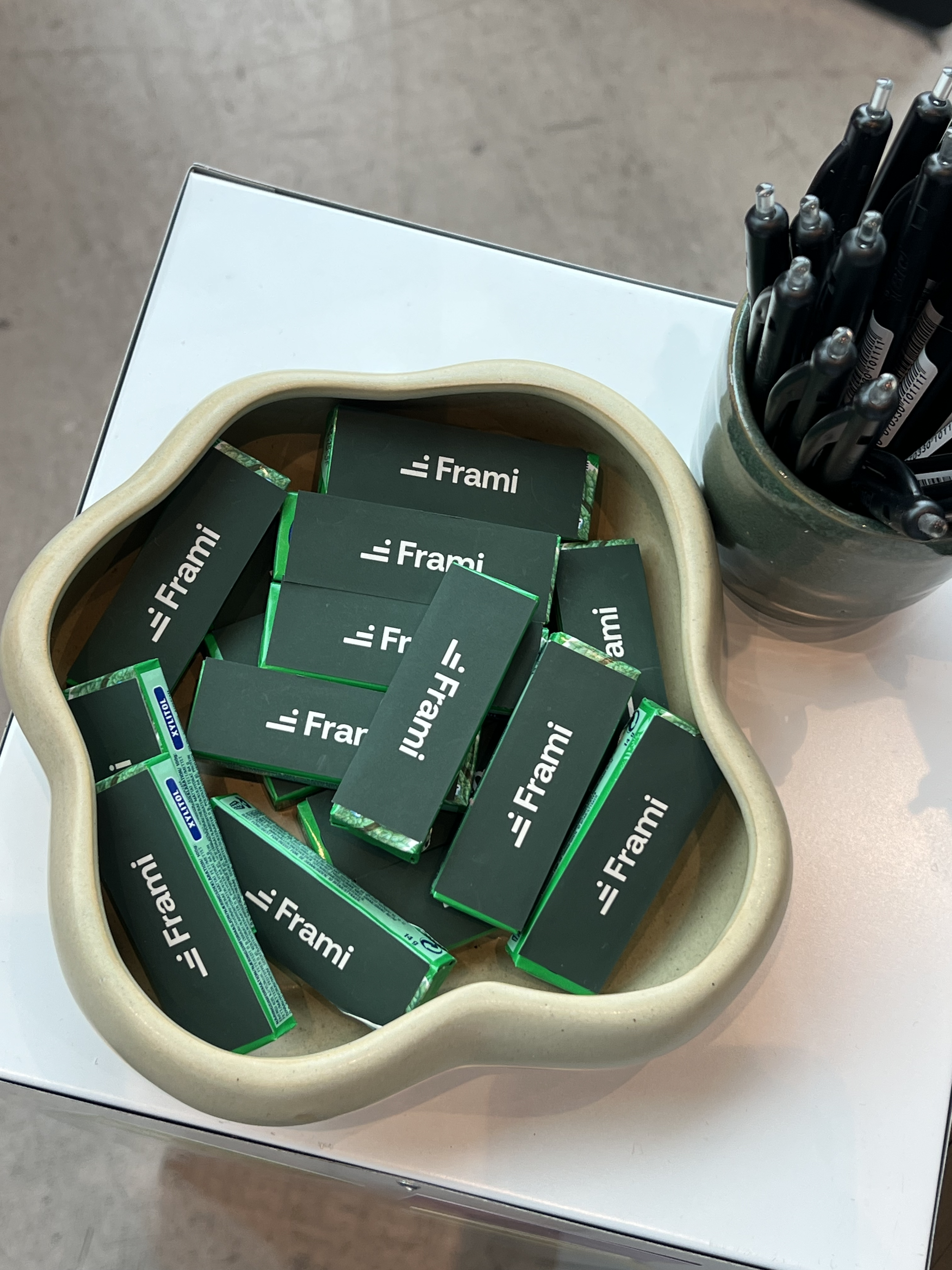
Frami Logo Redesign
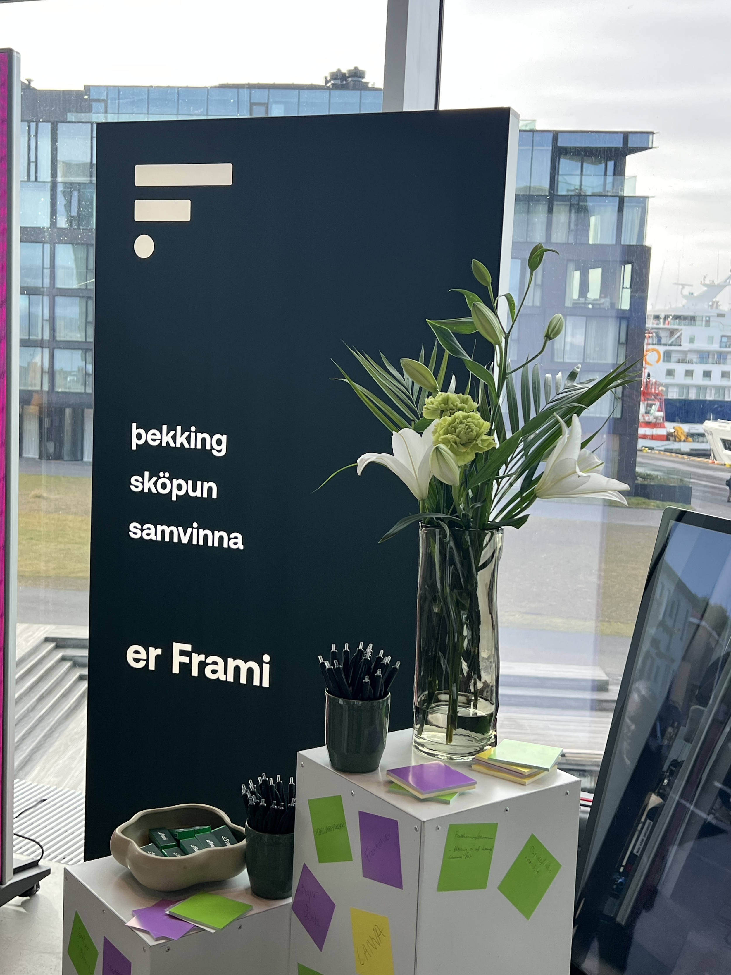
Frami is an Icelandic platform that helps organizations manage learning, training, and employee development. As part of a visual identity refresh, I redesigned the company's logo and refined its color palette to create a more modern and versatile brand presence. The goal was to improve brand consistency, enhance recognition, and develop a visual system that works seamlessly across digital and marketing materials.
Design Approach

I redesigned the original logo using a cleaner, more contemporary typeface to improve readability and strengthen the brand's visual identity. I also refined the color palette by introducing a vibrant primary green supported by complementary tones, creating a more flexible and cohesive system across digital and marketing applications.
The updated palette is centered around a vibrant green that reflects growth, learning, and progress—core values of the Frami platform. Supporting colors were carefully selected to add warmth and contrast, allowing for more dynamic compositions while maintaining visual consistency across different touchpoints.
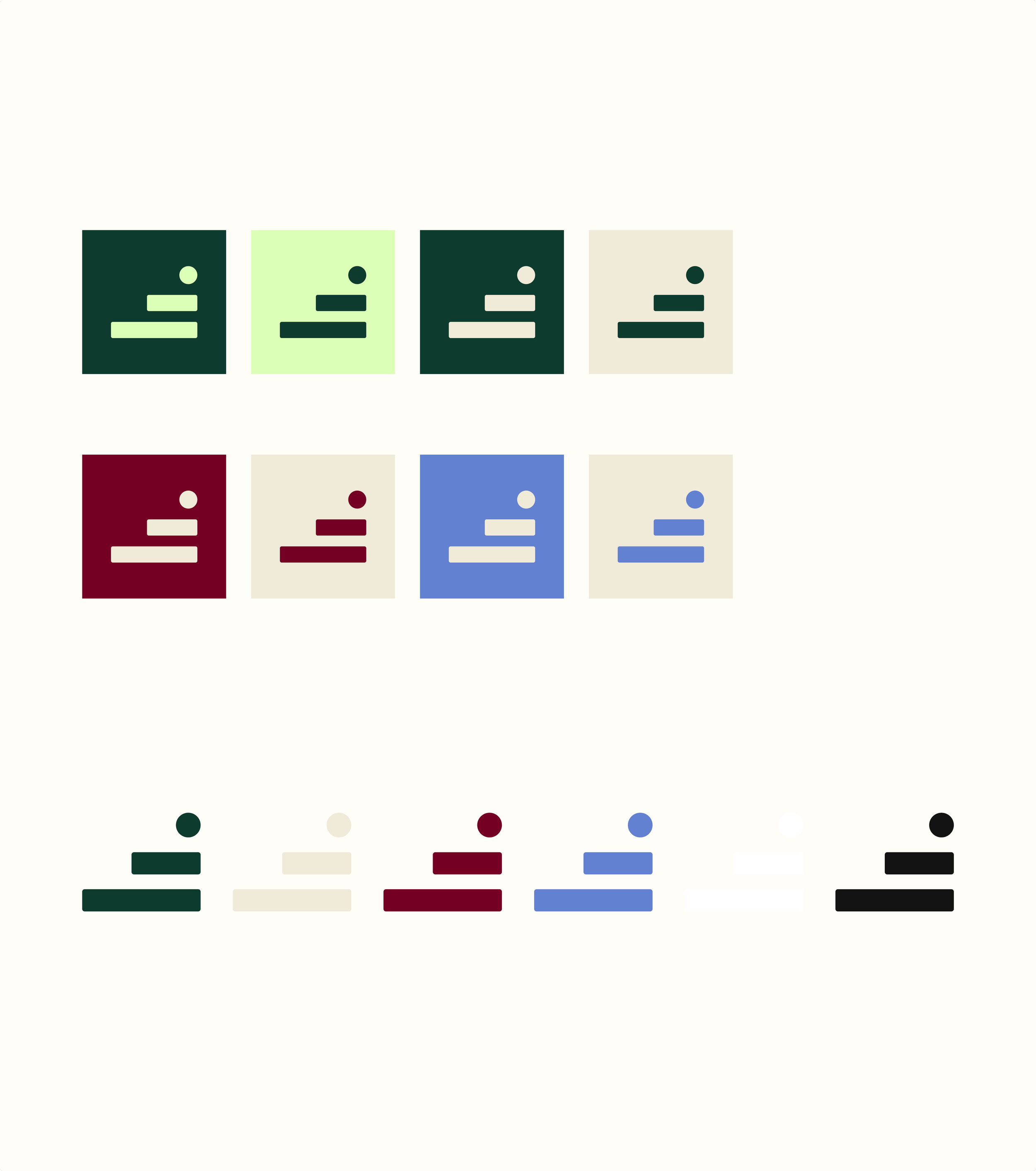
Color palette
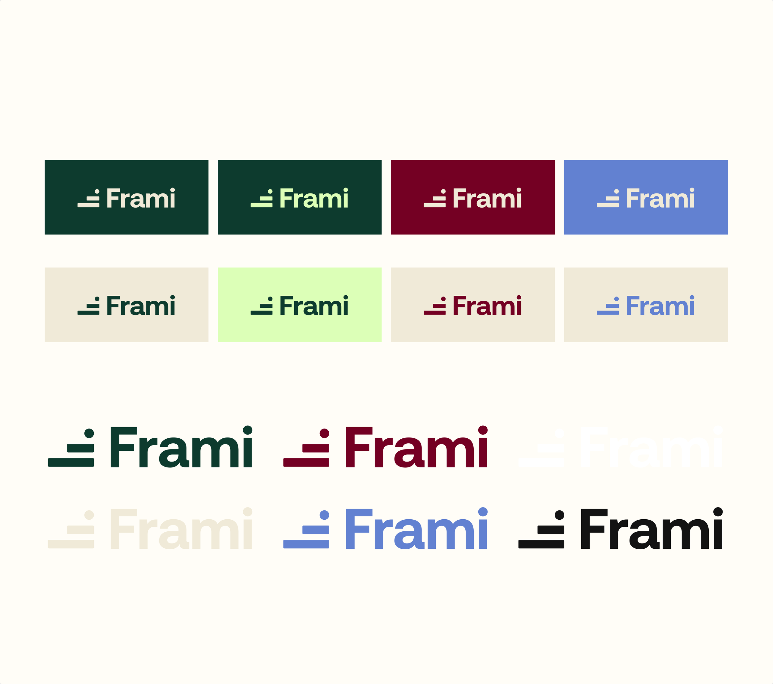
To increase flexibility, I developed multiple logo variations that work across different backgrounds, formats, and communication channels while maintaining consistency and brand recognition.
Logo main
The redesigned logo and refined color palette create a more cohesive and recognizable visual identity for Frami. The updated brand system is flexible across digital and print applications, providing a stronger foundation for future marketing and brand communications.
Outcome